Other Projects
What's in This Page?
There are many projects I designed or took care of that I couldn't add in the main "Projects" page of this website, considering I made it almost exclusive to digital mobile+ platforms.
So if you are wondering what this page is about, you got it; it's about all those nice and extra projects I was asked to complete that either aren't digital platforms or are just bits of some.
Have fun exploring all of them, going through logo designs for several companies, mobile game's icons, websites, corporate identities concepts and events merchandising.
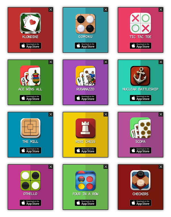
Deck Box Icons
At Outofthebit we created the most popular mobile card games in Italy. They all used to have different kind of icons, so once they were all up in the App Store's charts we decided we had to change the design of the icons to make our users aware of the fact they were all coming from our company. This way we would have created some trust in them to also download and try the other similar games we could offer. So we decided to communicate this brand identity step creating a family of icons resembling the italian's card's deck box everybody knew and loved. It was a success and the downloads of all these games improved soon after.
Santa Fara Coffee

This was one of the very first logo I have been asked to create for a company. It was a new coffee brand which wanted to make it clear to its costumers they were keeping things local and artisanal. So they wanted to use the name of their small town's patron saint to convey it. They are now, many years later, a well-established business, exporting their exquisite coffee beans in bars and houses all over Europe.
Indiana Online

I designed this logo for a company based in the United Arab Emirates in 2018. They focus on selling vintage and native american inspired objects and clothes in online shops and social media. With this work I had to communicate what the company sells and to who (target was mainly women), making it simple and modern.
Five in a Row

Gomoku was one of Outofthebit's oldest games, so we decided to restyle this project a bit, changing the name to "Five in a Row" (closer to our more successful "Four in a Row") and designing a new icon, more in line with this new concept. We used a familiar colour palette and a plasticky / shiny feel, as the real board looks.
Karate Gasshuku

Back in early 2018 I was asked by the English Goju Ryu Karate Federation of coming up with a consistent style and set of symbols for the whole event (the XXXII European Competition). I went on creating various logos for web, print objects, merchandising and posters. That was a new, fun and exciting experience I've enjoyed a lot.
Fanny's Make Up

A very locally popular brand in Italy commissioned me to redesign their logo. The founder, Fanny (like the titular logo name) started out as a make up artist, so the logo had to reflect this point more than anything, considering that's how the brand became popular. After a few dratfs, she was very happy with the result.
Un Goal per Cinisi

Together with many other people I helped organise a charity sport event to raise some money for a primary school. I also took care of all the graphic elements. Starting from this logo, I used a colour (blue) pointing to the sea colour of the town's beaches, the main historical building in that area (a Benedectine Palace), and the X (instead of italian "for") to represent the local political elections (considering the main teams playing at this event were politicians who wanted to also help the cause at the end of their election campaign).
Tripeaks
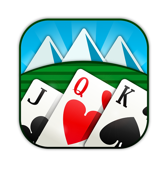
Tripeak was probably the quickest project I developed at Outofthebit. It took less than 4 weeks from start to finish, also because we reused lots of elements from other solitaires we had already completed. The icon had to scream what kind of solitaire it was, and at the same time we didn't want to go too abstract, as we did for Spider (you'll see it scrolling down). So I came up with this concept, where we literally show three mountain peaks (as it happens in the actual game with the cards), and three well contrasted cards in foreground. Mimicking the same shapes / peakes, mountains and cards create a nice shape even when in small size.
Capricci di Donna

After the Fanny's Make Up logo I had previously designed, many more local beauty companies asked me to create their business symbol. Capricci di Donna was one of those. This beauty care company wanted it horizontal and with the colours from their previous logo, which they were known for. That's the final result.
Arroccati
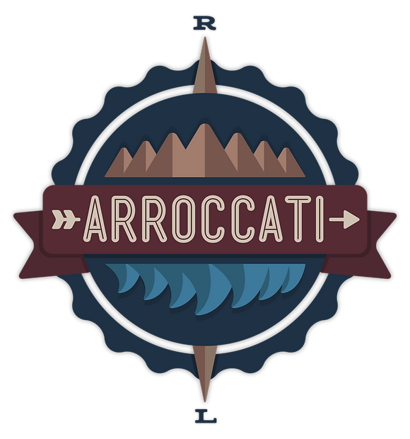
I created this logo for a Youtube / Social Media channel showcasing video travelling experiences and tips.
It had to reflect the nature of the project, so I conveyed that with multiple elements, such as the compass elements (R-L as the initials of the founders), the mountains (brown) and some upside down waves (light blue). Being specifically aimed at social media I wanted to keep the logo predominantly rounded.
OutOfTheBit.com

Once Outofthebit started focusing on developing more pixel-based video games for all kinds of consoles, we needed a quick and easy to navigate website. It had to reflect the new nature of the company (pixel and not mobile-only), without forgetting about all the other mobile board and classic games we were still offering. We came up with this kind of web landing page. Still work in progress, but that's the idea.
Spider
Among the many solitaire mobile app I created, one of them is Spider. As its "predecessors" (Scorpion and Klondike) we wanted to make it clear that Spider was part of the same family of solitaire games. So we decided to go for a silver frame, a bright colour inside and the actual titular word, spider, as the main object in the icon, resembling the elements of the other two successful and already worldwide known games.
Wear Up

This is part of a very short project I developed with a fashion student who was supposed to come up with a modern and digital medium relative to the fashion world. The student came up with an idea to develop a mobile app which would give the user fashion advices taking into account what's in his/her wardrobe. We had roughly 6 hours overall to create a mockup / prototype of the idea and deliver it to her professors.
Achievements

Developing many juicy apps, some of them had prize-winning systems. So depending on the action the user would take, it could win an "Achievement" inside a certain app or game. Here there are some of these achievements I created to make them all look like part of the same bigger set.
How to Silver

This is a logo I developed for a Twitch / Youtube Channel called How to Silver. It focuses on videogames funny video and tutorials. It is mainly focused on League of Legends materials: that's why this work resembles one of the famous game's rank (Silver). The channel now also creates music videos and has an online shop.
Annalisa's Make up

Another logo made for a customer who commissioned me this job for her beauty care centre. In this case, having a younger target we tried using more fun and pastel-like colours.
Sicily Weed - Light

This is a quick logo I designed for a legal light cannabis products seller in 2017. Colours where chosen to obviously resembling those of the real product and also to differentiate from the competitors in that area.
Freecell
This is an icon for another solitaire I created in 2019: Freecell. The project was very quick, taking around 2-3 weeks, but I particularly enjoyed working on this icon. I wanted, for the first time since I started creading icons for card games, focus the attention on just a zoomed detail of the artworks of the deck pieces.
Ground Sport & Food
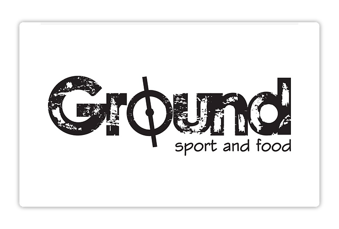
Back in 2011 I was asked to design a logo for a sport centre also offering a huge restaurant. I decided to resemble the football pitch grass effect of the font (and the center field on the "o"). This effect also helped convey the wholesome feeling of "farming" customers love seeing when eating at a restaurant.
Interstitial Ads
When I first started designing apps, one of the first tasks I took care of was to create and upload on our own server many different advertisement campaings. In 2015 I created this cross-platform one, consisting in many of our games at that time, showed in squarish interstitial ads all designed in a consistent style.